Inside the creative mind of — Swantje Hinrichsen
Swantje Hinrichsen is an art director, graphic designer and colourist with a strong focus on creating colourful visual identities and interior design. Swantje lives with her partner in a subdivided house from 1930 in the German city of Münster. Read along for a peek inside the creative mind of Swantje Hinrichsen.

A home divided into themes
Swantje recently moved to a new home in the beautiful city of Münster, located in the North West of Germany close to the Dutch border. Here she lives in a rental apartment of 145 square meters surrounded by a huge garden with scenic, old trees.
All the rooms in the apartment have been given themes and some even names. This playful approach to decorating is very characteristic for Swantje. Something you quickly realise, if you follow her colourful everyday life on Instagram: @swantjeundfrieda.
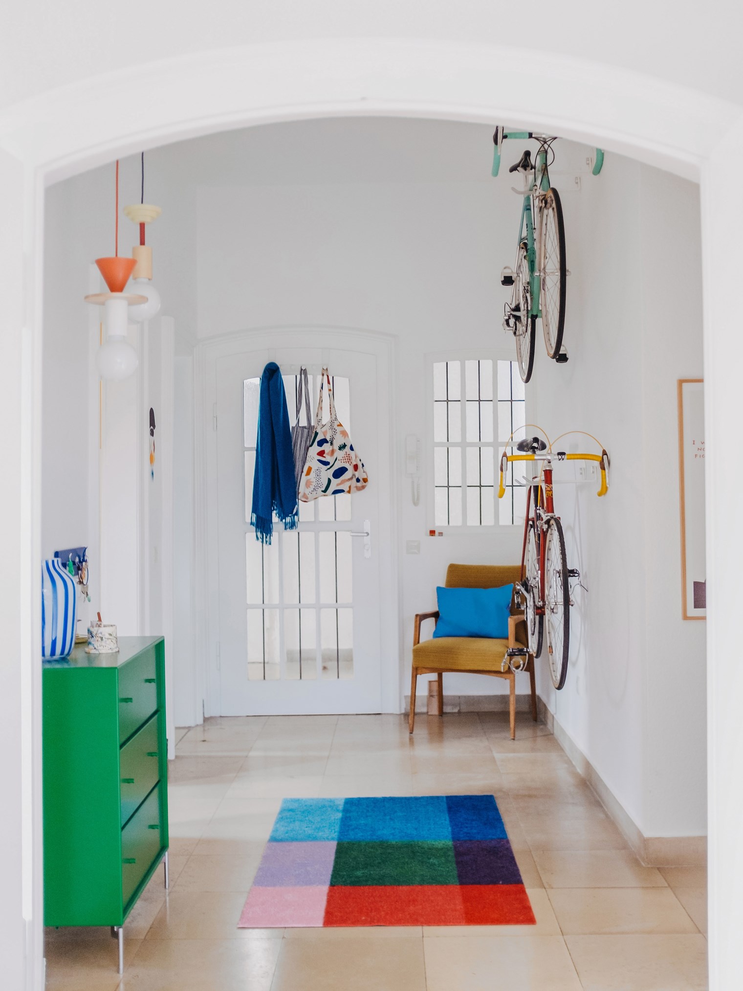
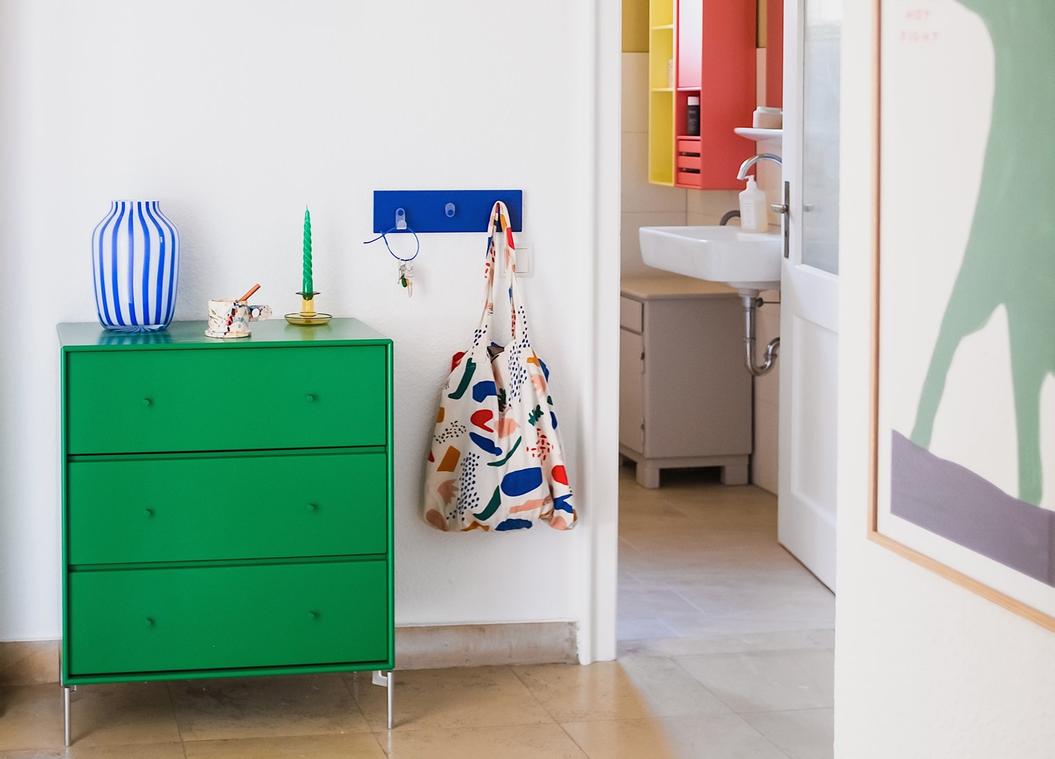
A happy entrance hall
When visiting Swantje, you get welcomed by the CARRY dresser in the energetic colour Parsley. Right beside is a clothing rack in the bold colour Monarch creating an entrance hall with a playful atmosphere.
Colours trigger emotions
Colours are like therapy to Swantje. Suffering from emotional synaesthesia where feelings trigger perceptions means that every feeling has a colour. This is also how Swantje takes on the renovation and decoration of a room.
I immediately get a sense of a feeling when I enter a room and colours pop up in my mind.
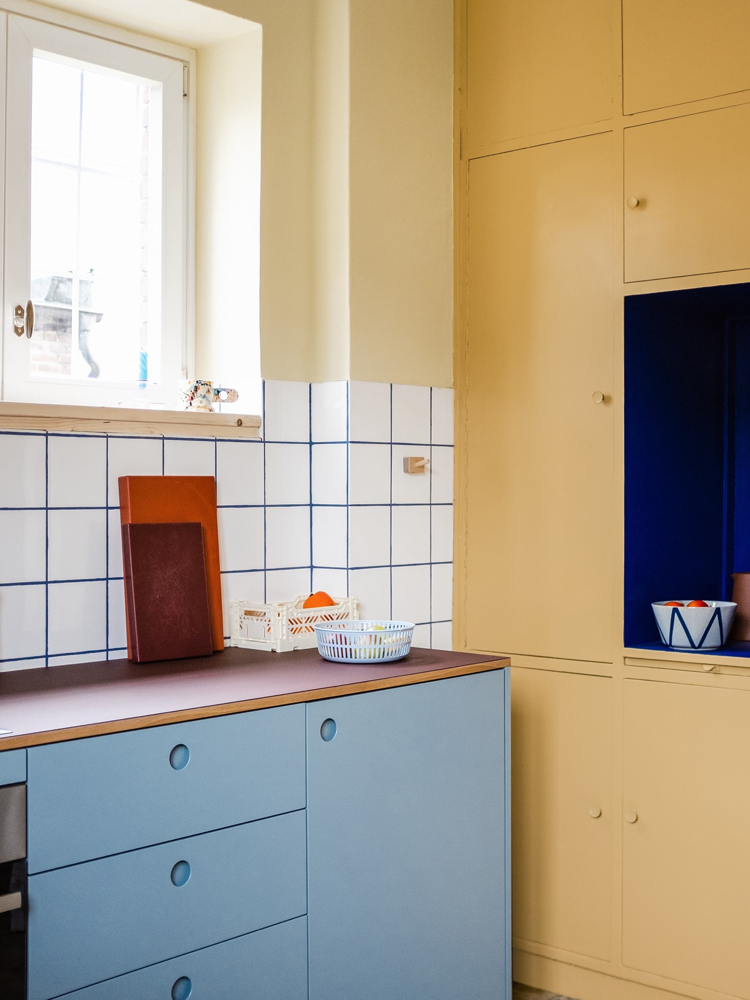
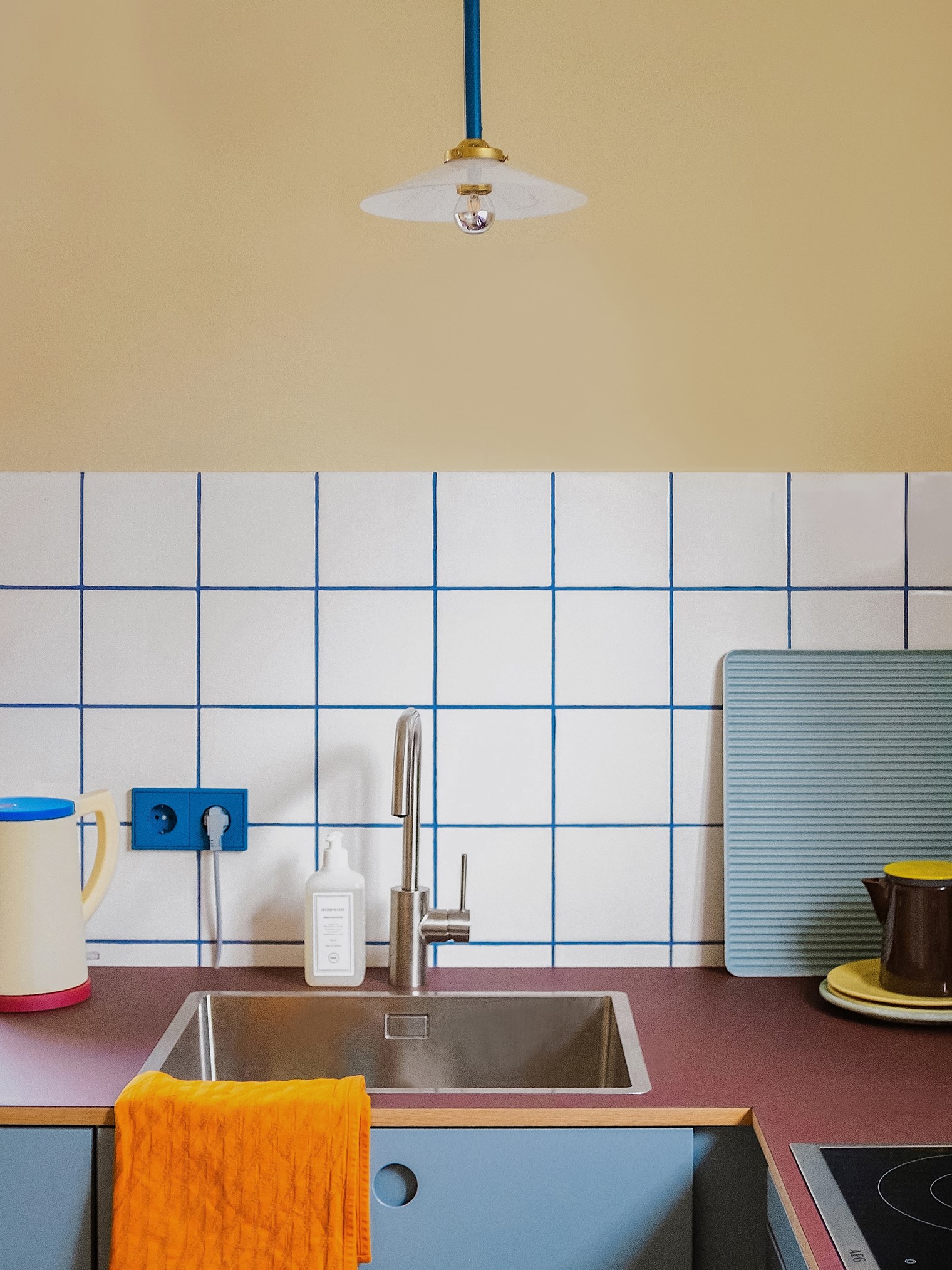
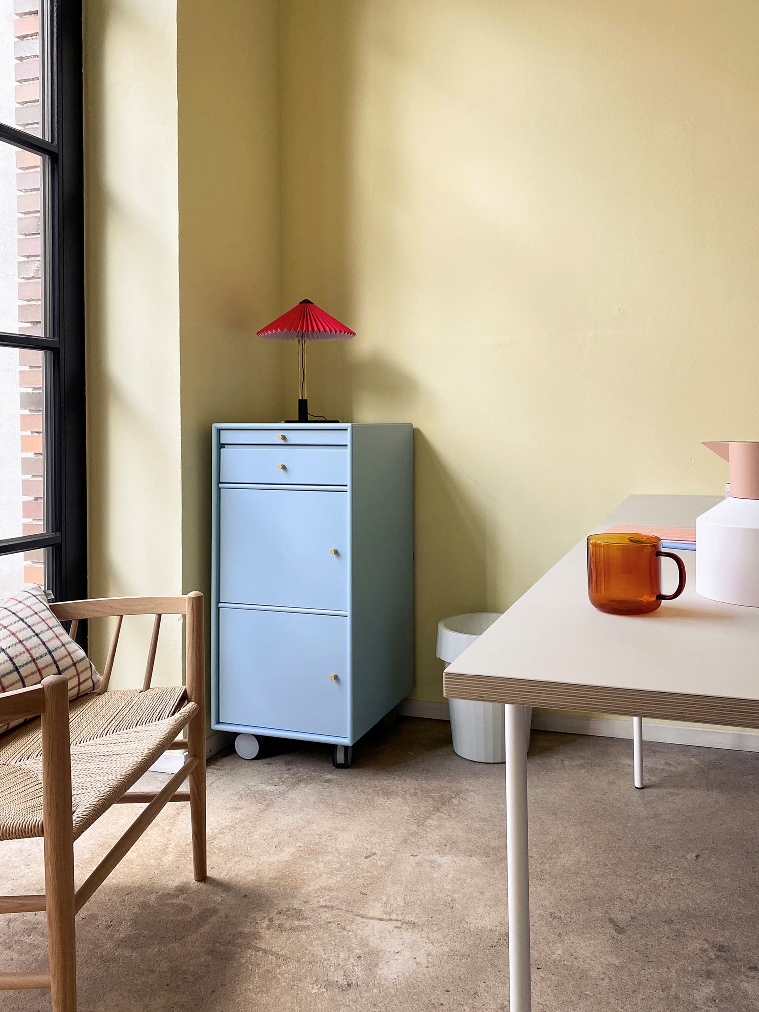
Before the renovation of their new home began, Swantje stood in the kitchen and imagined being in an old ice cream shop. Just like the one, fictional character of Swedish author Astrid Lindgren, Pippi Longstocking went to with her friends Annika and Tom. It might have been the old built-in cabinets that triggered the imagination, but Swantje suddenly knew that the colour palette for this room had to be pastel blue and yellow combined with contrasting colours such as orange, Yves Klein blue and dark red. She named this room #villekullakitchen.
The same thing happened with their small hallway. The room is facing north, so the lack of natural light is noticeable. However, one morning, Swantje experienced the reflections of sunlight coming from the neighbour’s house and she immediately knew what colour to use: “I felt like standing in a forest clearing – and of course it had to be green”. It took some time for Swantje to find the perfect shade of green, but she got a helping hand from a close friend from Sweden – with the surname Skoglund (Skog meaning forest in Swedish). Therefore, Swantje named the hallway #theskoglundhallway.
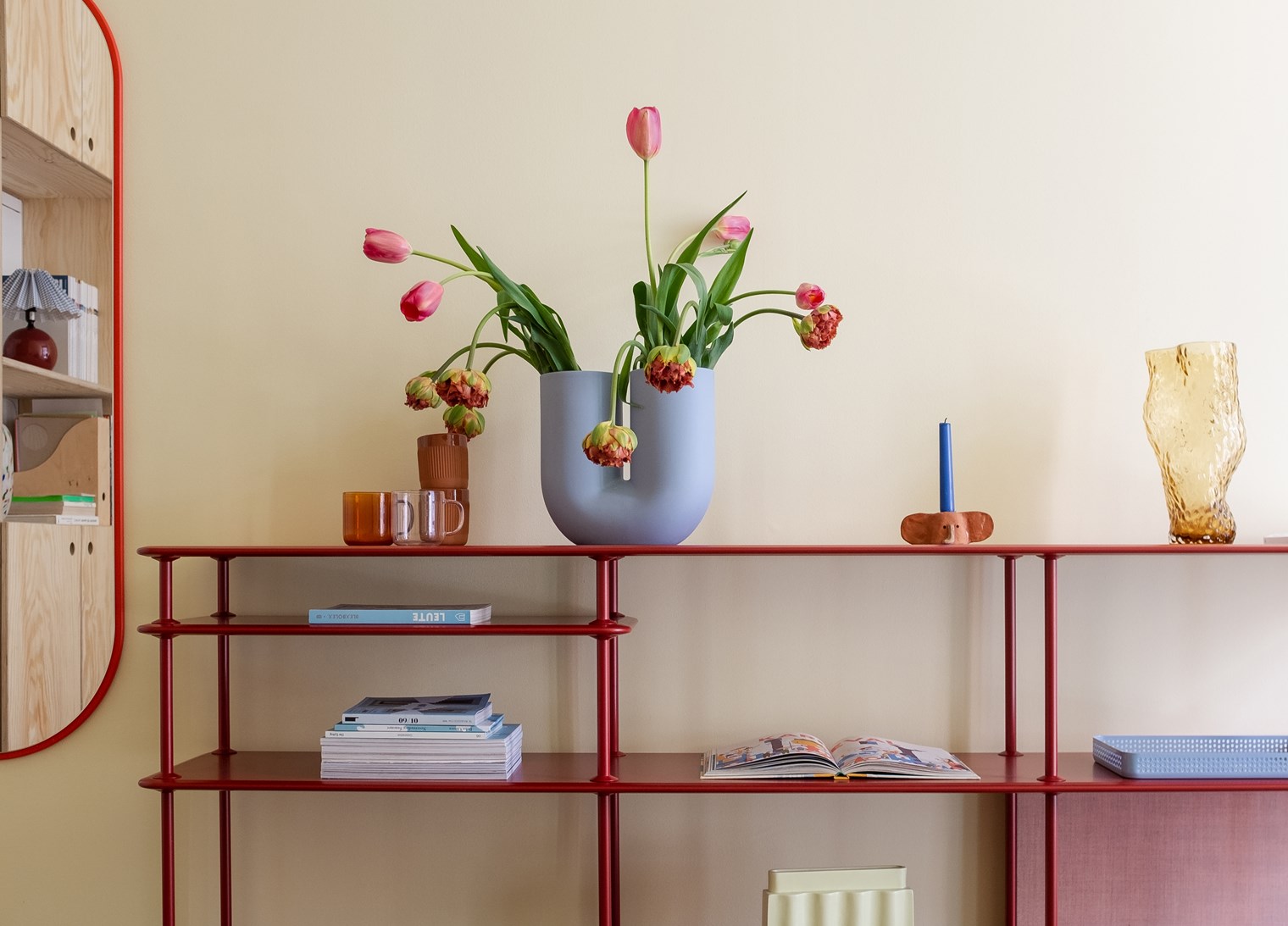
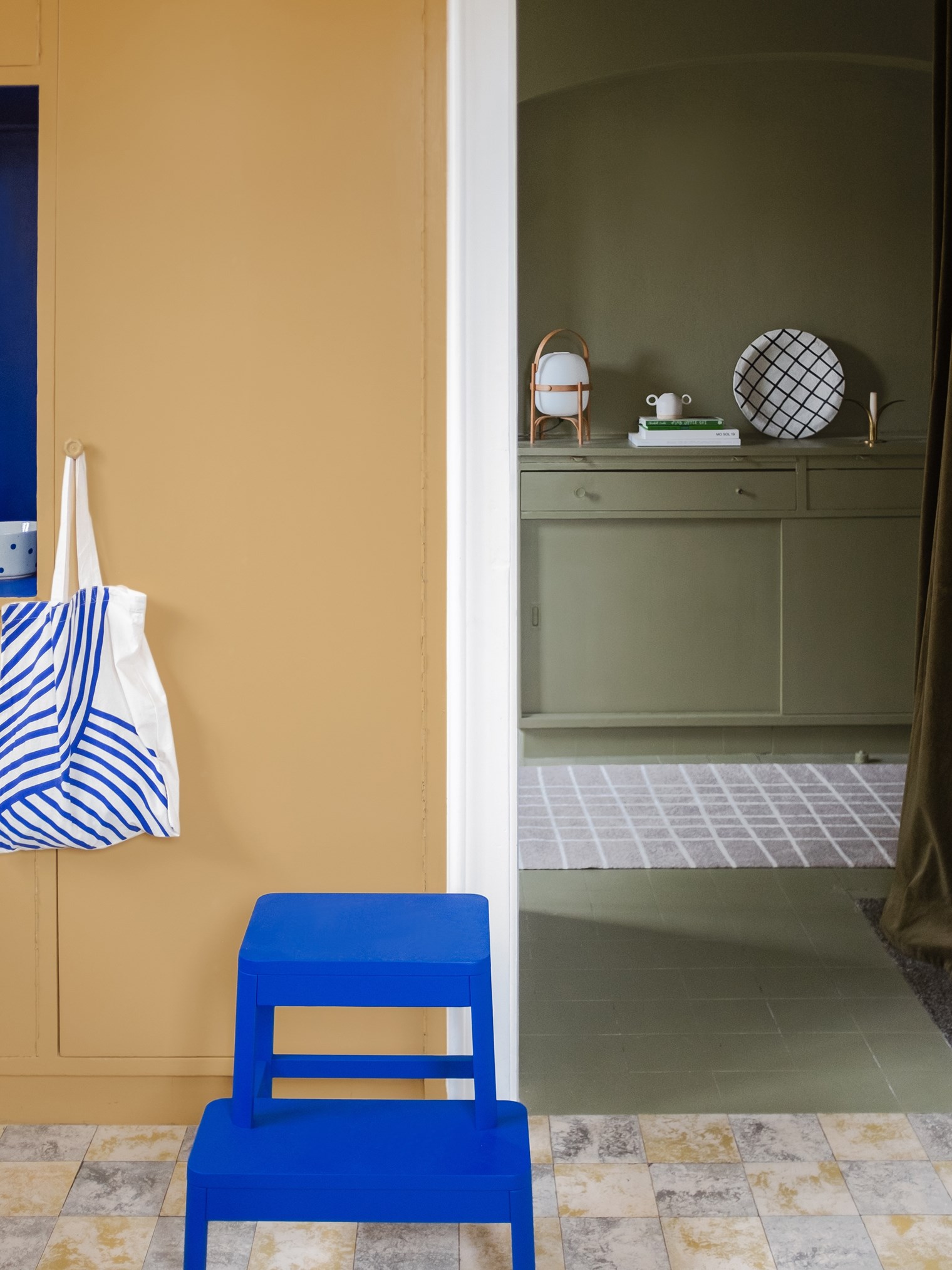
Warm and vibrant furniture
This colourful combination of different nuances of red includes the Montana Free 222100 in the colour Beetroot and the FIGURE mirror in Rosehip.
Three Montana favourites
If Swantje was to pick out three colours from the Montana colour palette representing her personality, she would go with Pine because it’s her favourite wood to work with, to smell, and to touch. With this colour Swantje imagines lying in the forest floor of pines looking up in the sky, her favourite daydreaming scenario.
The colour Azure also caters to this daydream of hers. The wonderful imagination of Swantje includes picturing faces and animals in the sky and the clouds’ formations.
The final colour Swantje chooses from the palette is Camomile, this represents her strong and invincible optimism. Despite experiencing a complicated childhood and some traumatic events in her twenties, Swantje has always kept her optimism close at heart.
Swantje's advice – know your style
Do you want to use colours like Swantje? Her advice to you is to acknowledge the type of person you are. Are you emotional about colours or are you more visually orientated? Take your time to experience your relations to colours and decide what room you want to use the colours for.