Inside the creative mind of — Lumikello
Five years ago, when Eva Kaiser founded her creative label Lumikello, she also started sharing images on Instagram of the new interior products photographed in her home. This was the very beginning of Eva’s creative journey as an influencer, which has also led her to working with interior decoration for clients. Read along for a peek inside the creative mind of Eva Kaiser aka Lumikello.

An architectural history of colours
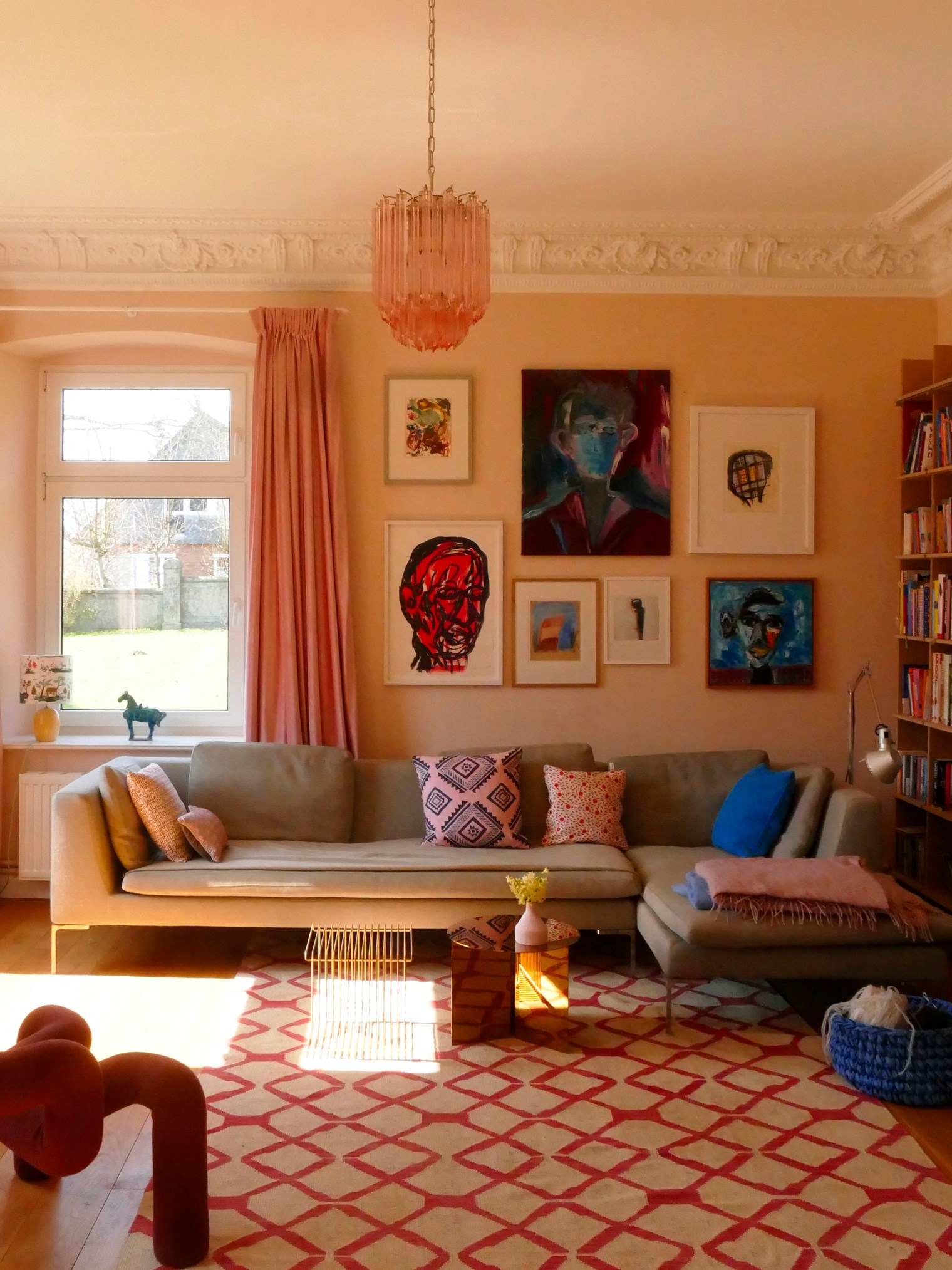
Two years ago, Eva moved with her family from the south of Germany to the north. They swapped out a modern, functional home with an old, beautiful manor and started breeding Icelandic Horses. The rooms in the main house of the manor Torhaus Warnau all have high ceilings, plenty of natural light, and a long history that Eva takes into consideration, when choosing colours for the interior.
During the renovation of the house, the family discovered old, colourful frescos. Unfortunately, the condition of the frescos was too poor to restore, but the frescos revealed that colours had been part of the manor from early on. Eva kept this in mind when she started planning for the interior decoration. She wanted an elegant and bright, solemn atmosphere with elements of a cozy and modern family home. On top of that there also had to be room for the family’s comprehensive art collection.
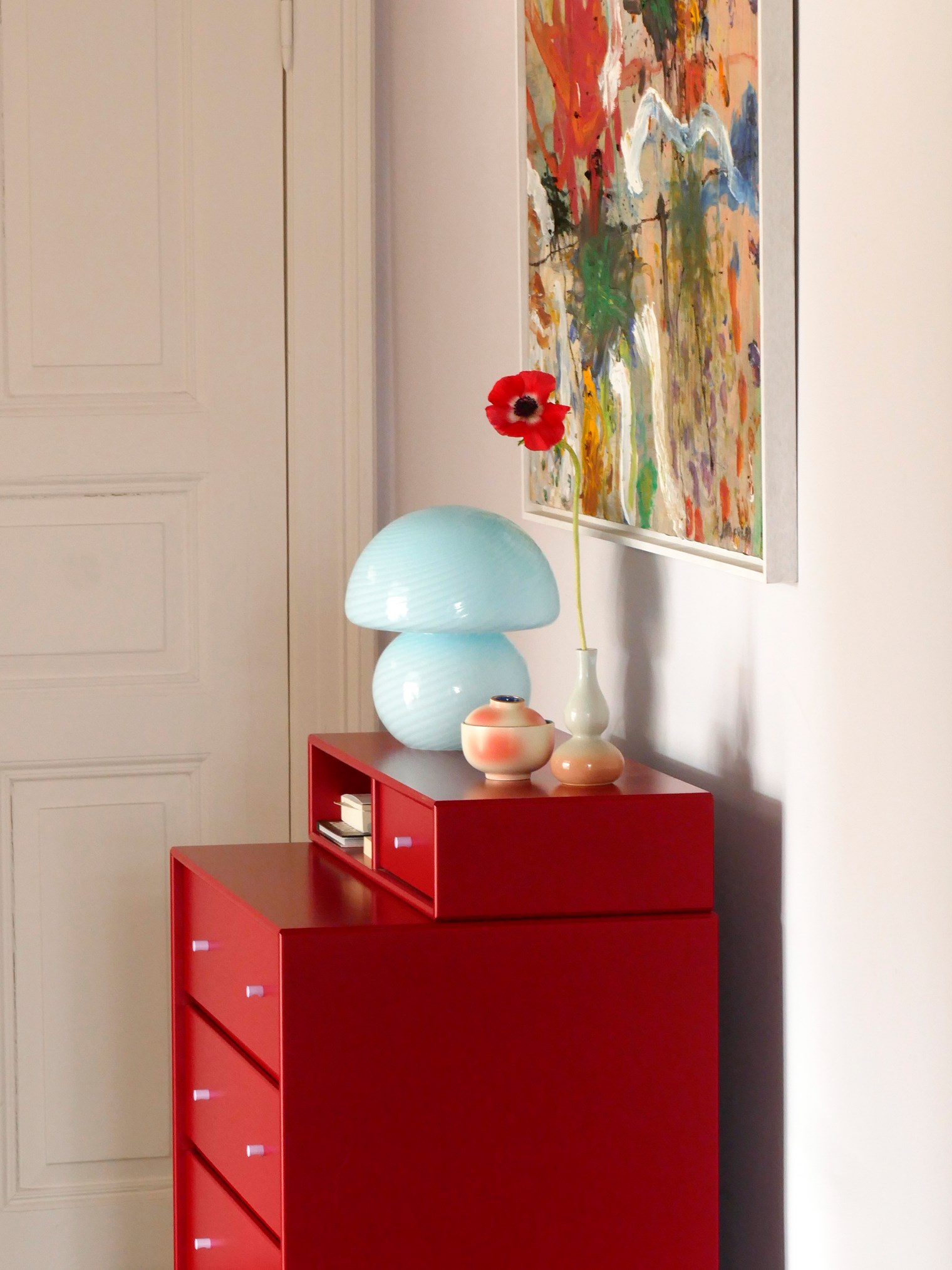
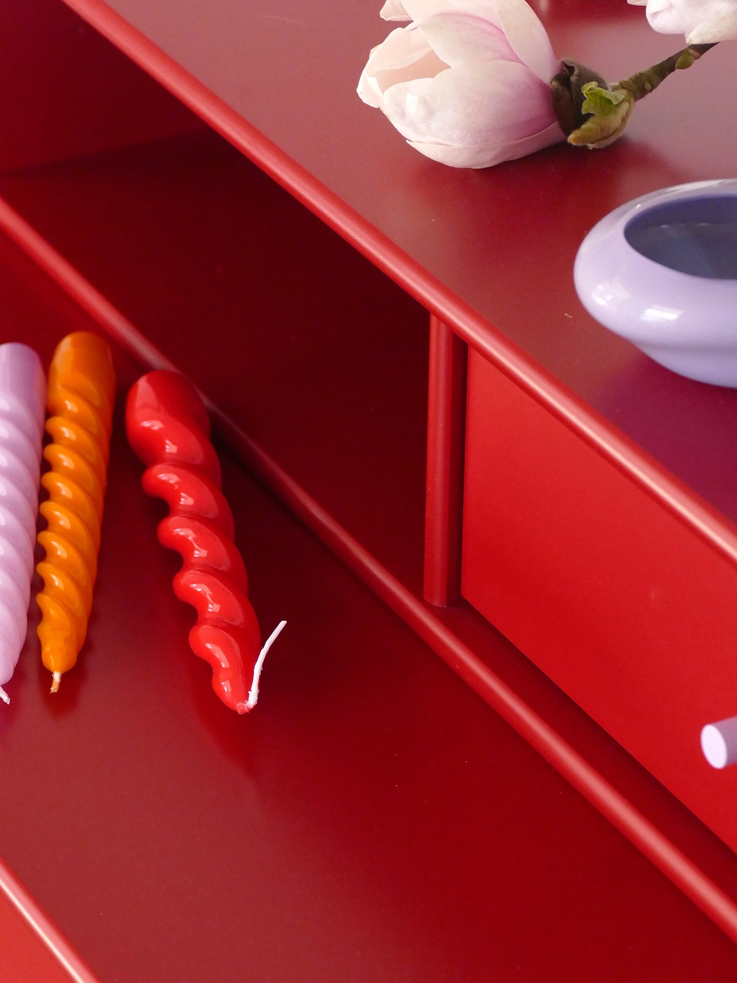
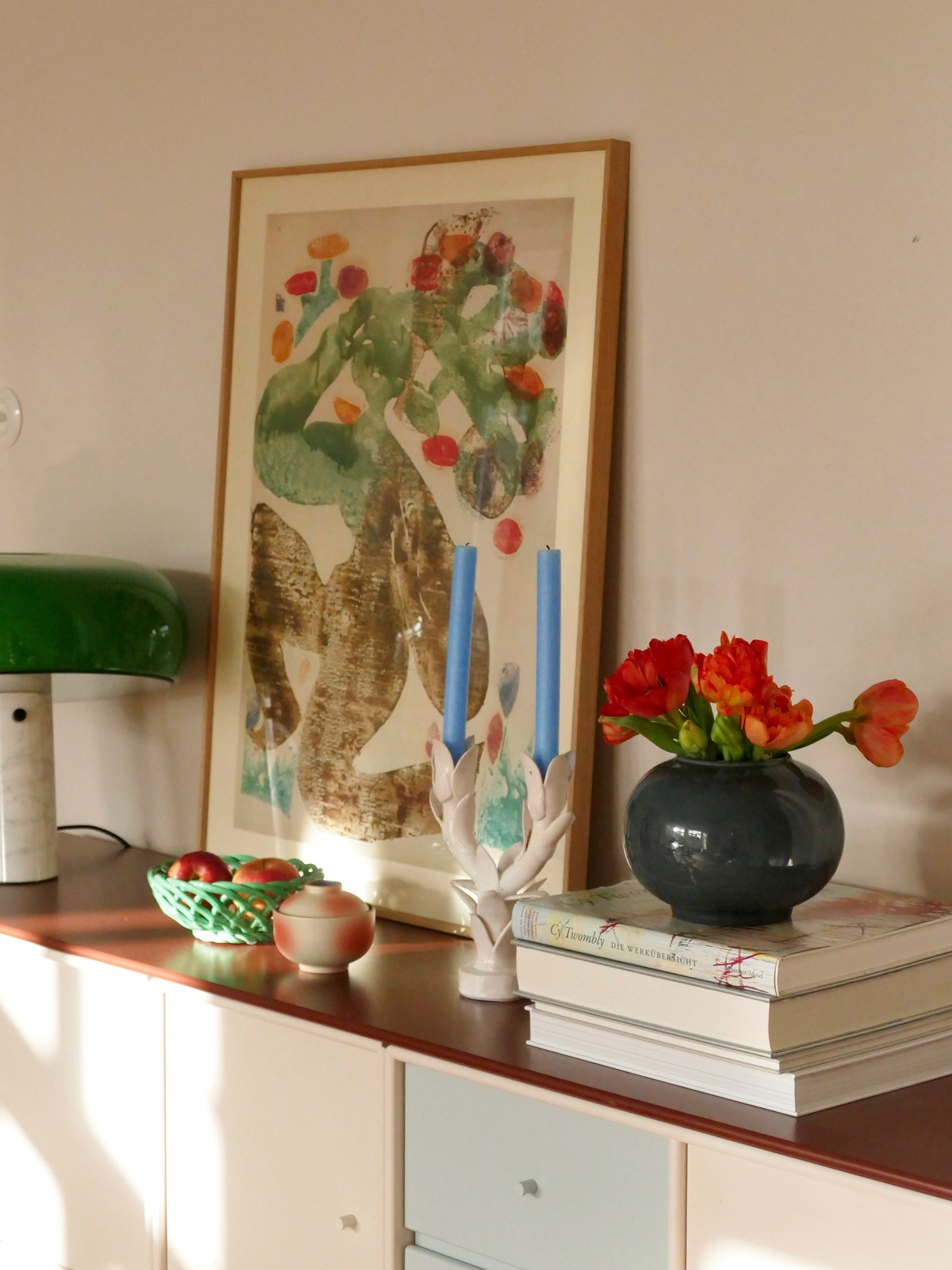
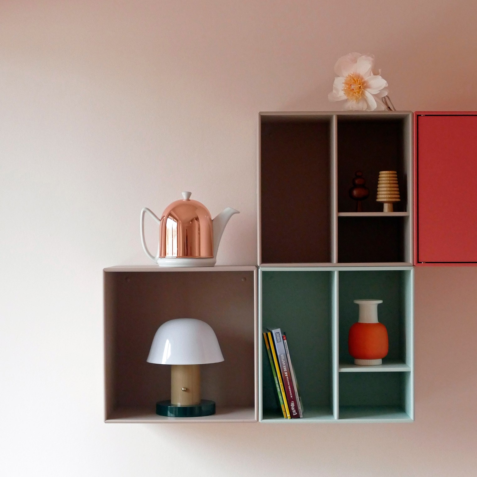
KEEP dresser in the entrance hall
The Montana KEEP dresser in Beetroot with Iris handles for scarves, keys and other belongings in Eva's entrance hall.
Choosing colours that suit the room
When choosing colours for the different rooms in the home, Eva focused on what the rooms would be used for and what ambience she wanted the colours to frame: “Sometimes a colour, that might not be your absolute favourite, might be the perfect choice for a special situation or light”. This is also one of the central points for Eva, when working with people in her colour workshops, teaching them ways to explore colours for their interior.
For example, Eva went for a yellow paint for the darkest room in their house, this way creating a bright and always sunny feeling. The yellow colour gives a cosy and relaxing atmosphere with an energising twist to it. The largest room in the house was painted in a pale pink to create a calm and soothing vibe. It took some time for her family to get used to Eva’s choice of colour, but now, they no longer consider it a bold choice.
A colour should bring out the best light, create the best ambience, and enhance the best part of the architecture. Or even be the best backdrop for your art collection.
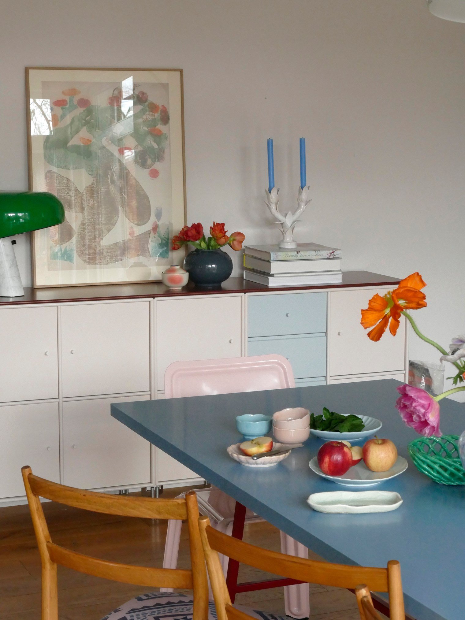
A bright sideboard with plenty of storage
A Montana sideboard with doors and drawers for maximal storage in the dining room. The warm colours Oat and Masala combined with the calming colour Flint induces a bright and cosy atmosphere.
Eva’s three Montana favourites
If Eva was to choose three colours from the Montana colour palette representing her personality, she would go for Oat because it represents her sensitive and indecisive side: “Oat is very unpredictable – sometimes pinkish sometimes beige depending on the light. Always soft and never boring”.
Eva thinks of the colour Parsley as funny and bright, without being optimistically happy as for example the colour Camomile. She compares these characteristics with her own sarcastic sense of humour.
The third colour Eva chooses is Juniper. Eva’s favourite colour blue makes her think of the seaside and glaciers of Iceland. The complex blue colour of Juniper represents the darker, more compound and thoughtful side of her personality.
Do you like Eva's style? Find more inspiration on Instagram. Follow @lumikello_ here.
Eva's advice – begin small and invest in help
If you would like to approach colours like Eva, you should find inspiration for colour combinations in nature, books and your wardrobe. She advises you to find your own personal favourites instead of looking too much to magazines and trends. Begin with small adjustments like a new green cushion for your sofa and take your time to discover how that colour makes you feel.
Eva also says that you shouldn’t hesitate to reach out for help – either contact a talented colour lover on social media or a professional consultant. Find someone likeminded you can exchange ideas with, and consider the possibility of spending money on advice from a pro. It usually pays off.
Eva has a small Montana storage unit with two open rooms and castors in her kitchen. The colour Amber matches the warm nuances in the room.
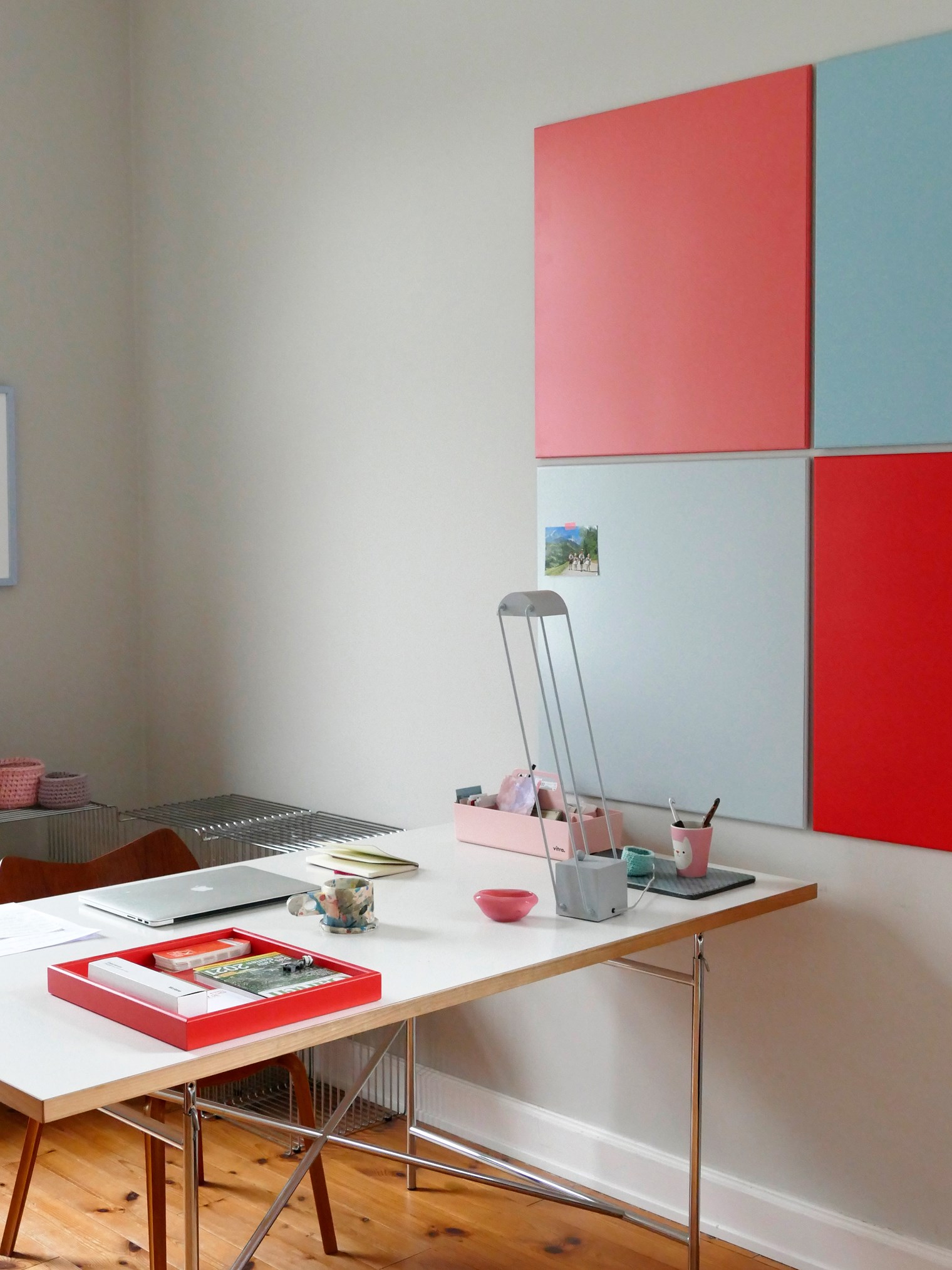
A colourful home office
Eva's home office is airy with splashes of colour. She has decorated the walls with the Montana magnetic noticeboards in the colours Rhubarb and Flint. Add a Montana Mini composition for extra storage.