Inside the creative mind of — Jonas Dahl Grue
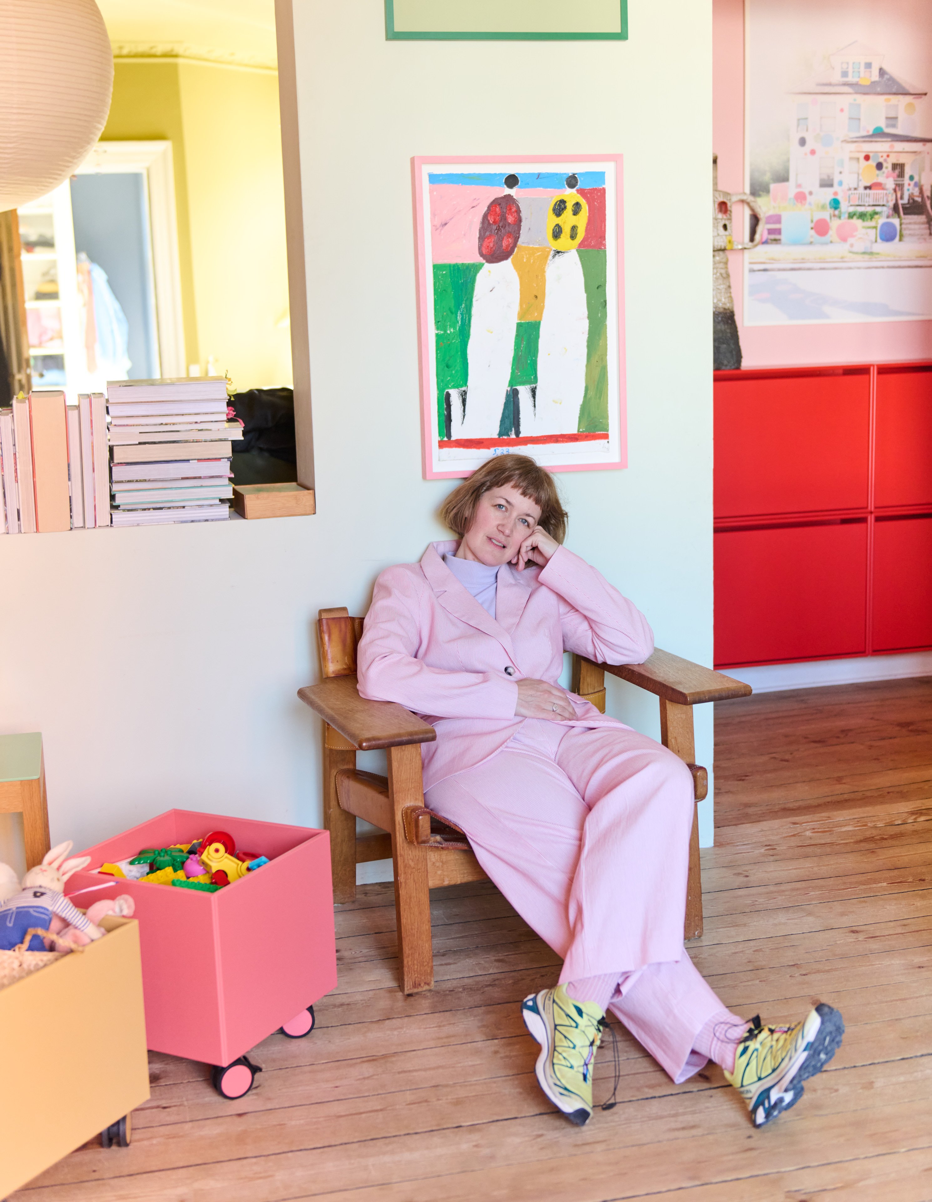
Jonas trained as a pastry chef at La Glace, one of Copenhagen's most celebrated confectioneries, and has since built a creative practice that spans cookbooks, children's books, illustration, and regular appearances as a TV cook on GO' Morgen Danmark. Colour has always been central to his work — and his home is no exception.

Where craft meets colour
For Jonas, colour is not a finishing touch – it is a fundamental part of the creative process. Growing up with two graphic designer parents, he developed an early sensitivity to aesthetics, nuance, and composition that has since shaped everything he makes. Whether he is decorating a cake, choosing an outfit, or sitting down to illustrate, the question of colour is always present.
Jonas's three favourites
If Jonas had to choose three colours from Montana's palette to represent who he is, he would pick Beetroot, Azure, and Amber.
Beetroot is an easy choice — it is the colour he lives with every day, running through his apartment as a defining thread. Bold, rich, and grounding, it captures something essential about his aesthetic sensibility. Azure speaks to a deeper, more personal connection. Blue is a colour Jonas has always identified with strongly — there have been whole chapters of his life spent wearing almost nothing but blue. It is the colour he feels most at home in. Amber rounds out the trio with warmth and quiet confidence. Its caramel softness reminds him that not everything needs to make noise. Some colours anchor a space simply by being calm.


A home with tension
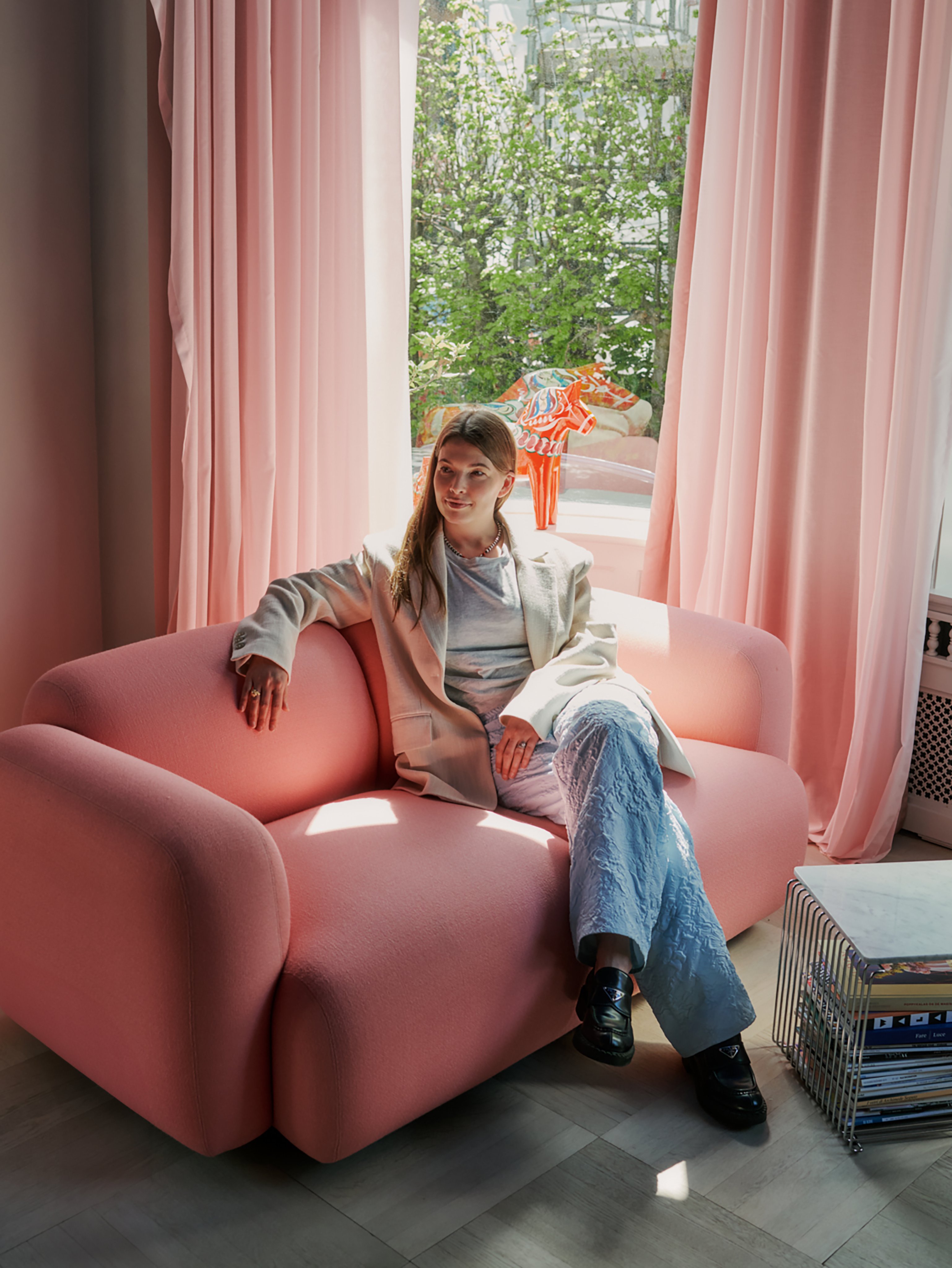
Jonas lives in Frederiksberg, in an apartment defined by classical grandeur – high ceilings, herringbone floors, and interconnected rooms. Rather than working against this architecture, he leans into the contrast it invites.
Dark red runs through every room in some form, a consistent presence that ties the home together. Against the warm wooden floors and ornate stucco detailing, it creates exactly the kind of depth and drama Jonas is drawn to. Alongside the classical bones of the apartment, he has placed contemporary furniture, art, and objects gathered from travels – curious things that pull the space in a different direction.
For Jonas, that tension is the point. Elements that seem to contradict each other, yet somehow still meet – that is what makes a room feel alive and interesting to the eye.
I use colour to create coherence. Walls in tones that flow between rooms, fabrics and furniture that either complement or offer counterpoint.


Jonas's advice – Start somewhere unexpected
For Jonas, the best way to develop a relationship with colour is simply to begin. Take a choice that sits just slightly outside the comfort zone, live with it, and see what opens up.
He believes that colours should speak to each other — and that there is always room for one that surprises. A home full of strong, considered colour does not happen all at once. It is a gradual thing, built through curiosity and a willingness to try.
Once colour opens up for you, the possibilities are enormous — and you will wonder what you were waiting for. Confidence builds the more you let yourself experiment.
Use your creativity
Go about it as Jonas and choose your favorite Montana Mega in our vibrant colour palette. With dozens of colours to combine, you can design a cabinet that fits your space and personality perfectly – playful, moody, or anything in between.


Design and function
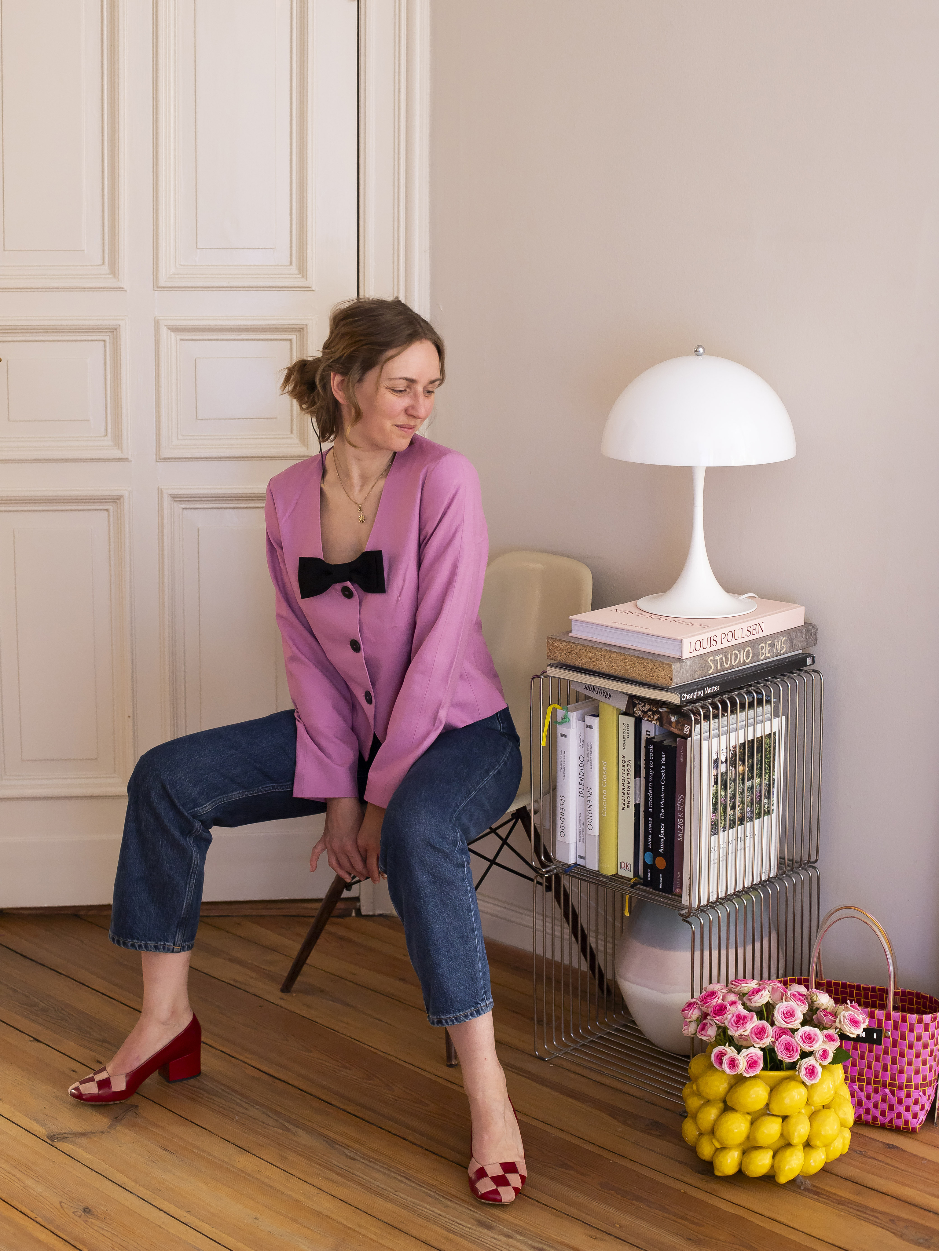
Panton Wire is a flexible system, and you can combine components and colours in different solutions depending on your wishes and needs. It is possible to create a unique and customised combination, whether you need maximum storage or a smaller shelf. Here Jonas has chosen to combine different sizes, all in chrome. Mounted directly on the wall, it takes up minimal space while offering maximum flexibility for glassware, ceramics, and favourite objects.
Where colour meets craft
Colour plays a central role in both of Jonas's creative outlets. In his cakes, getting the tones right, ensuring they work together and communicate the right feeling, is just as important as the craft itself.
Find more inspiration on Instagram – follow @yornas here.

Related articles